The stock market can be complicated; therefore, understanding the different aspects of the market is very important. Some trends go on in the market, such as the rising of stocks and the fall of stocks. If you want to understand how the stock market works and the different trends that go into this market, then technical analysis is the perfect option here.
Technical analysis is when the analyst uses the insights of the market, learns about behavioral economics, and another type of analysis to identify how everything works. Learning about these stock market trends can be tricky, but now you don't need to worry. Here is a detailed guide to help you spot market trends using technical analysis. So let's have a quick look at the article.

Different Trading Charts and How to Read Them:
When it comes to technical analysis, you first need to learn how to read different charts. Three charts are used in spot trends – the line chart, the bar chart, and the candlestick chart.
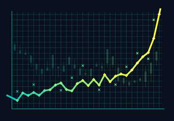
1.Line Charts:
Going for line charts first is the best option if you are a beginner and need to learn about these techniques and stock market charts. There is only one line here that connects all the prices in the stock during the time. The interpretation of this line is quite simple, and there are only a few things that you need to understand.
The drawback here is that this type of chart does not allow the traders or the analyst to know the activity that happens every day. This shows the trends that are occurring over the time interval. This type of technical analysis chart can be used to look at the overall working of the trends and how they have been rising and falling over time.
2.Bar Chart:
The second commonly used chart in understanding technical analysis is the bar chart. Different bars and sizes are used here, meaning the bars can increase or decrease over time. The width of the charts might also increase or drop based on vitality. When the market is volatile, the chart and the bars become more significant in size; this shows that the activity and the trends are in full swing. However, when the market is not volatile, then the width of the charts is, and the bar decreases, which shows that there is less activity in the stock market.
The vertical length of the bars shows the high and low prices in the stock market. At the same time, the horizontal lines in the bar charts show the opening and closing of the costs. Hence, this indicates that the interpretation of these charts is relatively straightforward.
3.Candlestick Charts:
The last chart commonly used for stock trends is the candlestick chart. This chart also checks the high and low prices and their opening and closing. The candle bodies are used to identify the closing and opening of the trends. At the same time, the candle's wick is used to interpret the high or low level of the prices.
This chart can benefit the analyst as it can be used to learn more about the trends and how the prices are moving in the market. Certain market combinations help the analyst understand the trends and how they work. Therefore, this chart is much more comprehensive and details the stock market trends.
Learning How to Read the Charts:
Now that you know the different types of charts, you need to understand how to interpret them. There are three main words and concepts that are used for the interpretation of these charts. Support and resistance are the two main components that you need to understand. Below is detailed information on all three words and how you can use them to interpret the data on the charts.

1.Support:
This is the baseline of the stock prices, and this is the point when the stock trends go low, and then the reversal of these trends starts. This means the sellers are not selling the stocks, and the buyers have taken over the market. At this point, the stores start reversing again, and the prices start to increase. This is also called an inflection point, when the stocks go as low as possible, and the price is put forward.
This is also when it becomes hard for the stocks to penetrate the baseline. When the stores come to the support level, then it is seen that the prices drop and the sellers stop selling the stock, whereas the buyers become very interested in getting the best offers for the stores because the prices are low.
2.Resistance:
Resistance is known to be the opposite of support. This is the level where the prices of the stocks are increasing like crazy. The resistance level is the highest level till where the stores can rise. Once they reach the resistance level, they need help to go higher.
In such cases, it is seen that the sellers are trying to sell as many stocks as they can because they will be getting a fantastic price. At the same time, the buyer is not interested in getting any supplies.
Conclusion:
This is the basis of the trends in the stock market and how the technical analyst uses different methods and charts to understand what is going on in the market. This entire process might seem easy to you. However, that is not the case. Sometimes these trends can get very complicated; hence you need to have a good grip on these charts and patterns to understand and interpret the trends in the stock market.